by Anthony Brienza
Image and artistic creation are inseparable from the Olympic Games. The first posters produced before the event and intended to support the official publications appeared at the Stockholm Games in 1912 and have since been systematically part of the Olympic mediation. Created by the Official Organizing Committees, these posters make it possible to both announce the Olympic and Paralympic Games and to offer a visual identity preamble of the event. Today, artists are witnessing limitless creative possibilities and exploring significant variations in styles and techniques. The textual content of the posters is therefore no longer the same as before and the graphic symbol is now particularly valued in favour of marketing and communications strategies. Olympic posters are now mostly produced by internationally renowned artists and designers and are intended to be part of a cultural heritage specific to the Games. For the Tokyo 2020 Olympic and Paralympic Games, several Japanese artists were specifically chosen to take part in this visual promotion process and express personal perspectives on the value and stakes of the event. Here is ACA project’s selection of six official posters :
L’image et la création artistique sont indissociables des Jeux Olympiques. Les premières affiches produites en amont de l’événement et destinées à accompagner les publications officielles apparaissent lors des jeux de Stockholm en 1912 et font depuis systématiquement partie de la médiation olympique. Créées par les Comités d’organisation officiels, ces affiches permettent à la fois d’annoncer les Jeux Olympiques et Paralympiques et d’offrir un préambule de l’identité visuelle de l’événement. Les artistes font preuve aujourd’hui de possibilités créatives illimitées et explorent d’importantes variations de styles et de techniques. Le contenu textuel des affiches n’est donc plus le même qu’auparavant et le symbole graphique est désormais particulièrement valorisé au profit de stratégies marketing et de communications. Les affiches olympiques sont désormais réalisées majoritairement par des artistes et des designers de renommée internationale et sont destinées à s’inscrire dans un héritage culturel propre aux Jeux. À l’occasion des Jeux Olympiques et Paralympiques de Tokyo 2020, plusieurs artistes japonais ont été spécifiquement choisis pour prendre part à ce processus de promotion visuelle et exprimer des perspectives personnelles quant à la valeur et aux enjeux de l’événement. Voici une sélection d’ACA Project de 6 de ces affiches officielles :
DAIJIRO OHARA – “ FLOW LINE “

Daijiro Ohara has graduated from the Design Sciences Department at the Musashino University of Art in Tokyo and currently works as a graphic designer. Trained in the art of typography, he is interested in the words and the evolution of their perceptions within various graphic universes. His field of production is therefore very wide since he is also dedicated to book design, illustration, video productions and computer science. His main concerns lie in the question of the designer’s role in today’s Japanese society, which, according to him, have become “abstract” within a relentlessly vigoroux context. For Ohara, modern design evolves alongside economic rules and the “linear technique”, but is also linked to the current progress of technology. He indeed considers the art of poster and graphic design as a true methodological concept, that through typography would represent a form of identity evolution that would also be linked with industrial and technological changes and their impacts on artistic practices. Daijiro Ohara therefore seeks to devote his art as a true self-expression rather than to maintain the industrial aspect of printing and graphic design.
In the work “Flow Line” made for the Tokyo 2020 Olympic Games, Daijiro Ohara’s graphic universe depicts the path of the Olympic flame that started in Greece and which travelled through more than 800 municipalities to reach Japan. This linear effervescence allows the artist to evoke the question of the human and the individual figure in this worldly event context. According to Daijiro Ohara, collective art and practices allow the human being to reveal and grasp connecting elements rather than to focus on the erratic side of the world in which we live, characterized by an infinite number of tangible and non-perceptible variations.
Daijiro Ohara est diplômé du département des sciences du design de l’Université d’art Musashino à Tokyo et exerce aujourd’hui en tant que designer graphique. Formé à l’art de la typographie, il s’intéresse aux mots et à l’évolution de leurs perceptions au sein d’univers graphiques variés. Son champ de production est donc très large puisqu’il se consacre également à la conception de livres, à l’illustration, aux productions vidéo ainsi qu’à l’informatique. Ses principales interrogations résident notamment dans la question du rôle que portent les designers dans la société japonaise d’aujourd’hui, qui selon lui seraient devenus “abstraits” au sein d’un contexte implacablement droit et vigoureux. Pour Ohara, le design moderne évolue parallèlement aux règles de l’économie et de la “technique linéaire”, mais est également à lier à la progression actuelle de la technologie. Il considère en effet l’art de l’affiche et du graphisme comme un véritable concept méthodologique, qui à travers la typographie représenterait une forme d’évolution identitaire qui serait également en lien avec les mutations industrielles et technologiques et leurs impacts sur les pratiques artistiques. Daijiro Ohara cherche donc à consacrer son art d’une véritable expression de soi plutôt que d’entretenir l’aspect industriel de l’impression et de la conception graphique.
Dans son oeuvre “Flow Line” réalisée pour les Jeux Olympiques de Tokyo 2020, l’univers graphique de Daijiro Ohara représente le cheminement de la flamme olympique partie de Grèce et qui a circulé à travers plus de 800 municipalités pour arriver au Japon. Cette effervescence linéaire permet à l’artiste d’évoquer la question de l’humain et de la figure individuelle dans le contexte de cet évènement planétaire. Selon Daijiro Ohara, l’art et les pratiques collectives permettent à l’être humain de révéler et de saisir des éléments connecteurs plutôt que se concentrer sur le côté erratique du monde dans lequel nous vivons, caractérisé par une infinie de variations tangibles et non-perceptibles.
HIROHIKO ARAKI – “THE SKY ABOVE THE GREAT WAVE OFF THE COAST OF KANAGAWA“
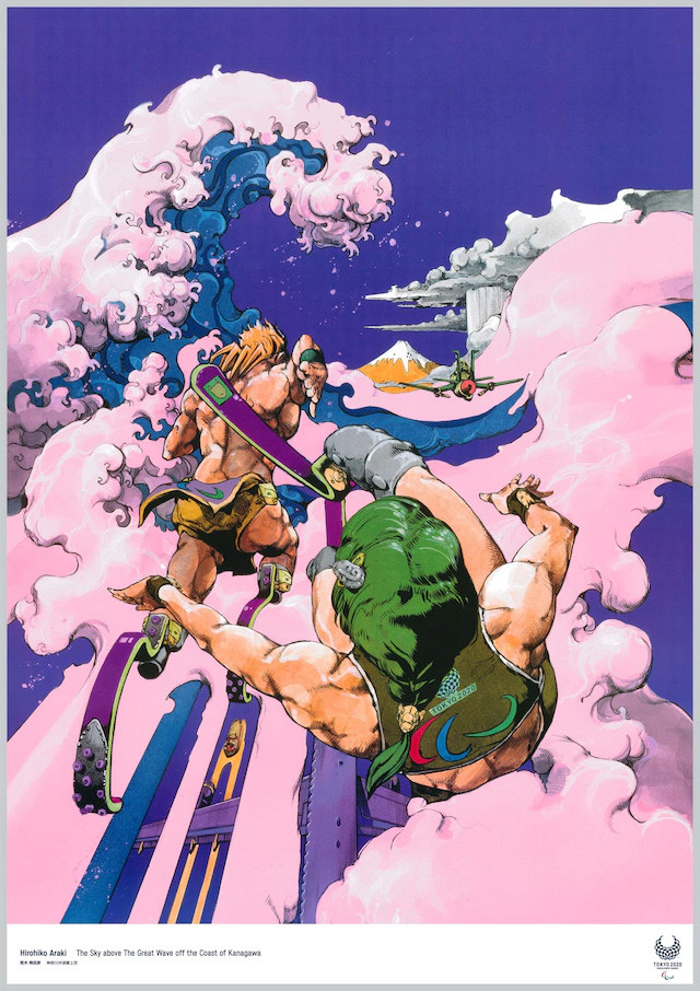
Hirohiko Araki, the author of the very famous “Jojo’s Bizarre Adventure”, still stands out in the so unique world of manga in Japan. He became a mangaka in the early 1980s, and quickly created a personal visual universe where interact multiple inspirations of his are. He has a great interest in Western art and more particularly in the works of Paul Gauguin, of which he mostly appreciates the treatment of the complementarity of colours within his compositions. Claiming to be from Mannerism, the great sculptures of the Renaissance have a decisive influence on the representation of its characters, who are known for their astonishing and surrealistic poses, the famous “Jojo Poses”. These are more special than ever, as the characters in the series are colorful and adorned with confusing clothing styles, Hirohiko Araki being a great admirer of fashion and fashion magazines (he produced the manga « Jolyne, Fly High with Gucci » in collaboration with the Italian luxury brand). During his career, he never stopped moving away from the main codes of the manga genre and his unforgettable style made « Jojo’s Bizarre Adventure » an unclassifiable work in Japan although considered a classic.
Hirohiko Araki was asked to produce a poster for the Tokyo 2020 Paralympic Games. “The Sky above the Great Wave off the coast of Kanagawa” is a personal reinterpretation of the traditional Japanese print style. The great wave of Kanagawa takes shape in a world, similar to the one in his main work, where the colours are totally surreal. “I imagined the sports gods descending on Japan, from a sky filled with clouds resembling turbulent waves. The composition motif was taken from the print of Katsushika Hokusai, « The Great Wave off the coast of Kanagawa ». Deciding on the colour of Mount Fuji was difficult, but I finally opted for a honey colour.”
L’auteur du très célèbre “Jojo’s Bizarre Adventure”, Hirohiko Araki détonne encore aujourd’hui dans le monde si singulier des mangas au Japon. Devenu mangaka au début des années 1980, il se crée rapidement un univers visuel personnel où se mêlent des inspirations multiples. Il porte un grand intérêt à l’art occidental et plus particulièrement aux œuvres de Paul Gauguin, dont il apprécie notamment le traitement de la complémentarité des couleurs au sein de ses compositions. Se revendiquant du maniérisme, les grandes sculptures de la Renaissance ont une influence déterminante sur la représentation de ses personnages, connus pour leurs poses étonnantes voire surréalistes, les fameuses “Jojo Poses”. Celles-ci sont d’autant plus invraisemblables que les personnages de la série sont hauts en couleurs et revêtus de styles vestimentaires déroutants, Hirohiko Araki étant un grand admirateur de la mode et des magazines fashions (il a réalisé par ailleurs le manga « Jolyne, Fly High with Gucci » en partenariat avec la marque de luxe italienne). Il n’a donc jamais cessé au cours de sa carrière de s’éloigner des principaux codes du genre manga et son style inoubliable fait de « Jojo’s Bizarre Adventure » une œuvre inclassable au Japon bien que considérée comme classique.
Hirohiko Araki a été sollicité pour réaliser une affiche pour les Jeux Paralympiques de Tokyo 2020. “The Sky above the Great Wave off the coast of Kanagawa“ est une réinterprétation personnelle de l’artiste du style de l’estampe japonaise. La grande vague de Kanagawa se dessine au sein d’un univers vraisemblablement similaire à celui de son œuvre phare où les couleurs sont totalement surréalistes. “J’ai imaginé les dieux des sports descendant sur le Japon, depuis un ciel rempli de nuages ressemblant à des vagues turbulentes. Le motif de composition a été tiré de l’imprimé de Katsushika Hokusai, “La Grande Vague au large de la côte de Kanagawa”. Décider de la couleur du Mont Fuji a été difficile, mais j’ai finalement opté pour une couleur miel.”
TAKASHI HOMMA – “ TOKYO CHILDREN ”
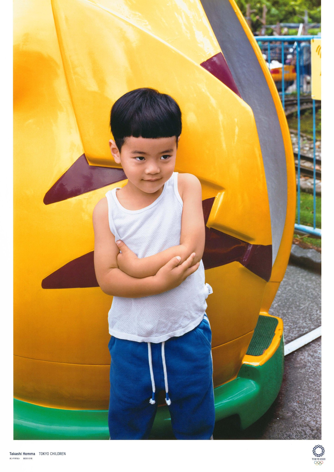
As a true Tokyoite, Takashi Homma (1962-) dissects and explores the urban energy of his hometown. Former student of the Nihon University College of Art, he enriched himself through many experiences (he was a photographer for two years for the bimonthly i-D Magazine, based in London) of a socio-political perspective based on correspondences between human beings and their urban environment. Placing men, women and children at the heart of his compositions, Takashi Homma seeks to question the different shades and tones of Tokyo’s many suburban neighborhood by immortalizing fragments of daily episodes. The artist’s photographic documentation bears witness to a personal narrative focused on the history and energy of his native city, discreet and anecdotal. He particularly reveals the “sterile” character of Tokyo’s contemporary architectural cladding, confronting human wandering with an urban landscape marked by the maintenance of an ever more flagrant modernity and evocative of the country’s ambitions. The photographer creates hypnotic images of his city, imprinted with an ambient impassibility as if the city was looking into its own reflection.
Takashi Homma participates in the artistic program of the Tokyo Olympic Games with the photography “Tokyo Children”. In accordance with his apprehension of the relationship between the human figure and photography, a child, presumably located in a playground and taking a restrained and modest pose, is placed at the centre of the composition and reflects the artist’s sensitivity to the Olympic Games. The artist evokes here the universal character of this event where, according to him, the population plays a role as important as the athletes.
Véritable tokyoïte, Takashi Homma (1962-) dissèque et explore l’énergie urbaine de sa ville natale. Ancien étudiant de la Nihon University College of Art, il s’enrichit à travers de nombreuses expériences (il fut entre autres photographe durant deux ans pour le bimensuel londonien i-D Magazine) d’un regard socio-politique porté sur les correspondances entre l’être humain et son environnement urbain. Plaçant ainsi les hommes, femmes et enfants au cœur de ses compositions, Takashi Homma s’attache à interroger les différentes nuances et tonalités des nombreux quartiers suburbains de Tokyo en immortalisant des fragments d’épisodes quotidiens. La documentation photographique de l’artiste témoigne d’un récit personnel basé sur l’histoire et l’énergie de sa ville natale, discrète et anecdotique. Il révèle notamment le caractère “stérile” du revêtement architectural contemporain de Tokyo, confrontant l’errance humaine à un paysage urbain marqué par l’entretien d’une modernité toujours plus flagrante et évocatrice des ambitions du pays. Le photographe crée ainsi des images hypnotiques de sa ville, empreinte d’une impassibilité ambiante, comme si elle regardait dans son propre reflet.
Takashi Homma participe à cette programmation artistique des Jeux Olympiques de Tokyo avec la photographie “ Tokyo Children “. Conformément à son appréhension du rapport entre la figure humaine et l’art de la photographie, un enfant vraisemblablement situé dans un parc à jeux, empruntant une pose retenue voire pudique, est placé au centre de la composition et traduit la sensibilité de l’artiste à l’égard des Jeux Olympiques. L’artiste évoque ici le caractère universel de cet évènement où selon lui, la population joue un rôle aussi important que les athlètes.
TOMOYUKI SHINKI – “ OFFENSE N°7 “

As a great admirer of combat sports, Tomoyuki Shinki (1982-) is today known for his very personal creations, mainly based on the physical interactions of athletes in action. He breaks down movements of intense contacts, where human figures are twisted under the black lines supported by the artist, which he makes on computer. These imposing athletes are vividly coloured, reflecting the artist’s personified vision of sporting activity, where heightened physical engagement would represent a form of elevation of the human being. By drawing abundant white spaces around athletes and leaving no distraction outside, Tomoyuki Shinki seeks to really focus the attention on the movements and physical dynamics of the athletes, inviting the observer’s gaze to follow the black lines that accompany the immediate action. Moreover, between distortions and surreal hues, Tomoyuki Shinki’s works even have a humorous dimension. The artist is now a member of the Incurve art workshop in Osaka and regularly exhibits in Tokyo.
Selected to be one of the official artists for the 2020 Tokyo Olympic and Paralympic Games, he created « Offense n°7 », a wheelchair-basketball scenery, one of the major sports of this competition. “On the many sporting events, what should I choose? I decided on wheelchair-basketball because I saw a lot of games, which had an impact on me”, Tomoyuki Shinki was probably shocked by the intense commitment of the players and the energy he evokes here is a real source of inspiration for him and would encourage people to focus more on these sport practices.
Grand admirateur de sports de combat, Tomoyuki Shinki (1982-) est aujourd’hui reconnu pour ses créations très personnelles, basées principalement sur les interactions corporelles des sportifs en action. Il décompose ainsi des mouvements de contacts intenses, où les figures humaines se retrouvent tordues sous les traits noirs appuyés de l’artiste, qu’il réalise par ailleurs sur ordinateur. Très vivement colorés pour la plupart, ces athlètes imposants font part de la vision très personnelle de l’artiste à l’égard de l’activité sportive, où l’engagement physique exacerbé représenterait une forme d’élévation de l’être humain. En dessinant des espaces blancs abondants autour des athlètes et ne laissant aucune distraction extérieure, Tomoyuki Shinki cherche donc à focaliser véritablement l’attention sur les mouvements et les dynamiques physiques des sportifs, invitant même le regard de l’observateur à suivre les lignes noires qui accompagnent l’action immédiate. Entre déformations et teintes surréalistes, les œuvres de Tomoyuki Shinki comportent même une dimension humoristique. L’artiste est aujourd’hui membre de l’atelier artistique Incurve, à Osaka, et expose régulièrement à Tokyo.
Sélectionné pour être l’un des artistes officiels pour les Jeux olympiques et paralympiques de Tokyo en 2020, il réalise l’œuvre “Offense n°7 “, une scène de Basket-fauteuil, l’un des sports majeurs de cette compétition. “Sur les nombreux événements sportifs, quel sujet devrais-je choisir ? J’ai décidé du Basket-fauteuil car j’en ai vu beaucoup de matchs, qui ont eu un impact sur moi”, Tomoyuki Shinki a été vraisemblablement bouleversé par l’engagement intense des joueurs et l’énergie qu’il évoque ici est pour lui une véritable source d’inspiration et inciterait à davantage à s’attarder sur ces pratiques sportives.
KOJI KAKINUMA – “ OPEN “
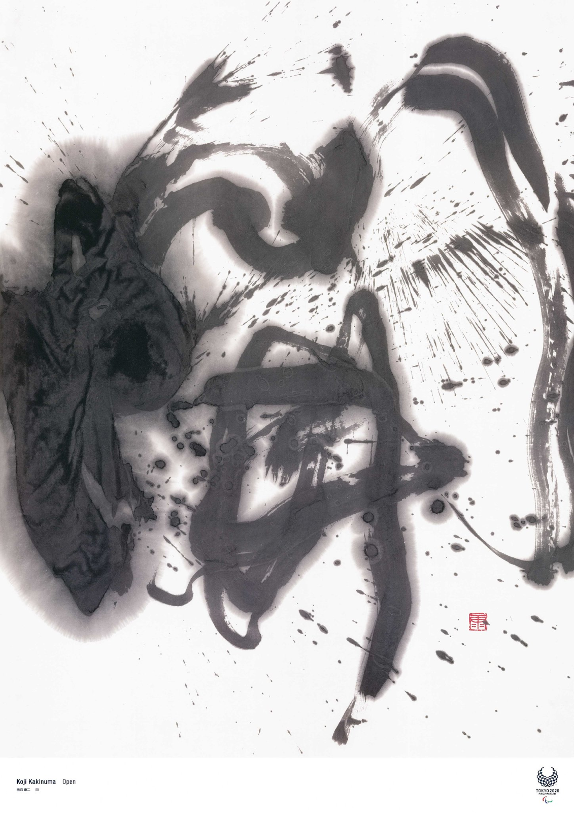
The artist Koji Kakinuma is introduced to the art of traditional calligraphy at the age of five. He was trained in a classical apprenticeship inspired by the sanpitsu (三 筆, “three brushes », a term used to refer to groups of renowned calligraphers in groups of three ) of the Showa era (1926-1989), before graduating in 1993 in Visual Arts from Tokyo Gakugei University. Inspired both by the protocol dimension of traditional Japanese arts and by the spontaneity of contemporary practices, he gradually transgressed the art of calligraphy (the shodo) by extending his techniques beyond the original concepts. Koji Kakinuma works punctually and considers his graphic expression as an ontological questioning of time and the human being. His very expressive style takes many different forms and is interpreted according to his impulses and energy to which he gives at the time of creation. He also freed himself from traditional formats, performing large-scale calligraphy and practising the art of performance. Koji Kakinuma considers his art to be part of an “eternal present”, where the instantaneity of the work would contribute linking Japanese artistic excellence, resulting from a long technical and theoretical history, to modern sensibilities. These last ones are particularly receptive to this kind of pictorial investigation, between ancient inspiration and contemporary creation.
Koji Kakinuma’s artwork for the Tokyo 2020 Paralympic Games, “Open”, is a true achievement of his artistic spirit. The character represented is the one of the openness (開), and testifies to his philosophy and approach to this world sporting event. For him, these games are a great opportunity to open up a little more to the world, with the ambition of passing on to the next generations a perpetual will of celebrations and understanding between populations.
L’artiste Koji Kakinuma s’initie à l’art de la calligraphie traditionnelle dès ses cinq ans. Il est formé à un apprentissage classique inspiré du sanpitsu (三筆, « trois pinceaux » terme utilisé pour désigner des groupes de calligraphes renommés réunis par groupe de trois) de l’ère Showa (1926-1989) avant de sortir diplômé en 1993 en arts visuels de la Tokyo Gakugei University. Inspiré à la fois par la dimension protocolaire des arts traditionnels japonais et par la spontanéité des pratiques contemporaines, il transgresse progressivement l’art de la calligraphie (le shodo) en étendant ses pratiques au-delà des concepts d’origine. Koji Kakinuma travaille de manière ponctuelle et considère son expression graphique comme un questionnement ontologique sur le temps et l’être humain. Son style très expressif prend donc de nombreuses formes différentes et s’interprète en fonction de ses impulsions et de son énergie auxquelles il cède au moment de la création. Il s’affranchit également des formats traditionnels, réalisant régulièrement des calligraphies à grandes échelles et pratiquant l’art de la performance. Koji Kakinuma considère son art comme faisant partie d’un “présent éternel », où l’instantanéité de l’œuvre participerait à lier l’excellence artistique japonaise, résultant d’une longue histoire technique et théorique, aux sensibilités modernes. Celles-ci sont en effet particulièrement réceptives à ce genre d’investigations picturales, entre inspiration ancienne et création contemporaine.
L’œuvre de Koji Kakinuma réalisée à l’occasion des Jeux Paralympiques de 2020 à Tokyo, “Open”, est une réalisation tout à fait fidèle à son esprit artistique. Le caractère qu’il représente est celui de l’ouverture (開), et témoigne de sa philosophie et de son approche à l’égard de cet évènement sportif mondial. Pour lui, ces jeux sont une formidable opportunité de s’ouvrir un peu plus au monde, dans l’ambition de transmettre aux prochaines générations une volonté perpétuée de célébrations et d’entente entre les populations.
NAOKI URASAWA – “NOW IT’S YOUR TURN”
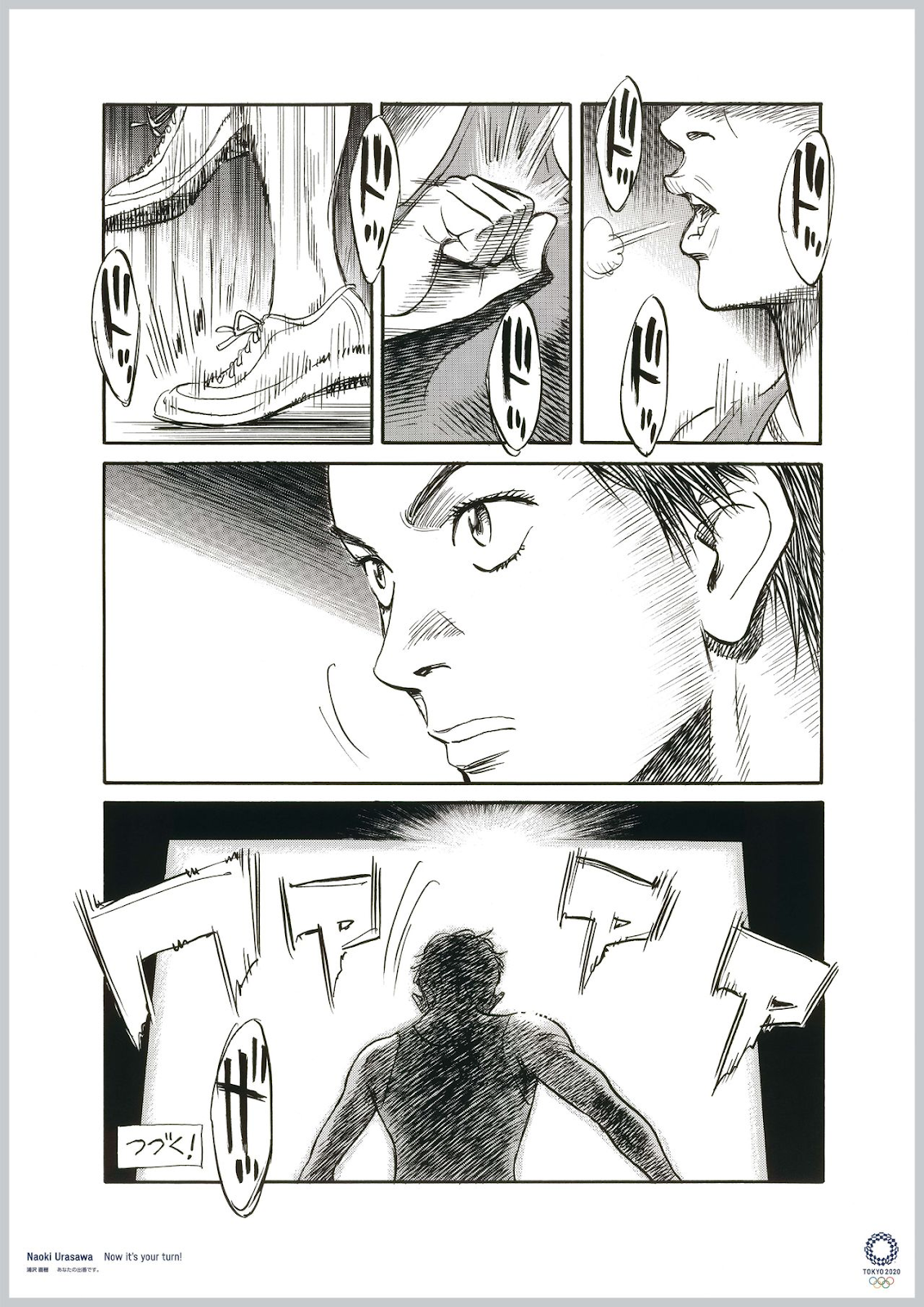
Naoki Urasawa was born in 1960 in Fuchu, Tokyo Prefecture. Known for great hit mangas such as « Monster », « 20th Century Boys », « Master Keaton » or « Yawara! », he is now considered to be one of the greatest Japanese mangakas and is also a guitarist and rock singer. From his childhood at school, he was very interested in drawing and took as his main inspiration the work of Osamu Tezuka (considered as the father of the manga, he is notably the author of « Astroboy », « Phoenix the Firebird » or « The Story of the Three Adolfs »). His inspiration is deep throughout Naoki Urasawa’s career until today. It was in the late 1980s that he began to become truly prolific and to refine his graphic style. His drawings are precise, careful and build coherent universes where intrigues oscillate between psychological thrillers, uchronic narratives and daily life comic moments.
The board he made for the Olympics, “Now it’s your turn”, has a real symbolic value in terms of sports and the popularity evolution of manga in Japan. Indeed, successful sports mangas (such as « Slam Dunk », « Eyeshield 21 », « Captain Tsubasa » and « Ashita no Joe ») have not stopped animating weekly publications since the creation of the Weekly Shōnen Jump, keeping millions of readers in suspense. Urasawa here compares the intensity of a sporting event with that of an end of a chapter, concluding the board with the phrase “To be continued!”. Being himself a big fan of sport, he wants to highlight the transcendent side of sporting events that will animate the Japanese summer.
Naoki Urasawa est né en 1960 à Fuchu dans la préfecture de Tokyo. Connu pour des grands mangas à succès tels que Monster, 20th Century Boys, Master Keaton ou encore Yawara!, il est considéré aujourd’hui comme étant l’un des plus grands mangakas japonais et est également guitariste et chanteur de rock. Dès son enfance à l’école, il s’intéresse de très près au dessin et prend comme principale inspiration l’oeuvre d’Osamu Tezuka (considéré comme étant le père du manga, il est notamment l’auteur d’Astroboy, Phoenix l’oiseau de feu ou encore L’histoire des trois Adolf). Celui-ci plane par ailleurs sur l’ensemble de la carrière de Naoki Urasawa et aujourd’hui encore. C’est à partir de la fin des années 1980 qu’il commence à devenir véritablement prolifique et à personnaliser son style graphique et narratif. Ses dessins sont précis, soignés et construisent des univers cohérents où les intrigues oscillent entre thrillers psychologiques, récits uchroniques et moments de vie comiques.
La planche qu’il réalise pour les Jeux Olympiques, “Now it’s your turn” a une véritable valeur symbolique quant au sport et à l’évolution de la popularité des mangas au Japon. En effet, les mangas de sport à succès (tels que Slam Dunk, Eyeshield 21, Captain Tsubasa ou encore Ashita no Joe) n’ont cessé d’animer les publications hebdomadaires depuis la création du Weekly Shōnen Jump, tenant en haleine des millions de lecteurs. Urasawa compare ici l’intensité d’une rencontre sportive à celle d’une fin de chapitre, concluant la planche avec la phrase “To be continued!”. Étant lui-même un grand fan de sport, il souhaite ici mettre en valeur le côté transcendant des rencontres sportives qui rythmeront l’été japonais.